
Programers or Pretty Widgets
MenuBar/BarButton
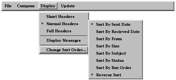
These pair of widgets allow for the creation of menu bars. BarButton is a light weight label widget the will request it's parent MenuBar to pop up a menu if it has one. MenuBar is a modified Box widget, it supports only horizontal boxes. It also does 3D highlighting of it's children when the mouse button is depressed. And allows the mouse to slide along and show each popup as the mouse passes over the selection.
In the picture above you can see a menubar with barbuttons. Also you can see a PopupMenu and PmeEntry/PmeLine with cascaded menus.
MenuButton
SuperClass of Command widget that provides a pulldown menu when the button is pressed.
MenuArrow
SuperClass of Arrow widget that provides a pulldown menu when the button is pressed.
PopupMenu
This widget provides a 3D highlighted popup box for it's children. It also does 3D highlighing around it's children as the mouse is moved. If the child has a cascaded submenu that will be poped up within 3/4 of a second or when the mouse is moved in the right side of the button. Also supports popup help clues for individual menu entrys.
PmeLine/PmeLabel
These widgets display a label or a line. PmeLabel supports cascaded menus. These widgets do not do any highlighting. These widgets also do not have a window of their own and draw in the parents window.
PmeSelect
This widget allows for selections and marks to placed on pull down menus. These can include radio groups and all other features of Select.
Arrow
Draws a 3D looking arrow pointing in the requested direction, provides a callback when the button is pressed. The arrow widget can be set to auto repeat after a given delay.

Canvas
An empty widget, provides callbacks for expose and resize. Also provides hooks for handleing mouse events and clue support.
Clue
All widgets can support popup clues if the mouse remains in them for long enough without any action. A clue widget should be build at the start of each application, then setting each widgets "clue" resource will cause a help clue to pop up after the timeout has expired.
Command
Basicly a label with button callbacks and highlighting.

Frame
Draws a 3D frame around it's child. This widget supports many ways of drawing pretty frames around it's child. It can do both raised and sunken highlights, the highlights can be beveled, edge or groove. The widget also allows for a label to be placed at the top of bottom, and a line draw around the child. This line can be either a simple line or a raised or sunken groove.
Grip
Draws a 3D box and accepts mouse input. Used by Panner.
Label
This widget displays a label with bitmaps. It includes threeD shading.

Line
This widget draws a line in it's window. Very simple widget.
List
The list widget manages a list of selections. It support outline, underline, crossout, shape mark, color and font selection for each of it entries. The list widget also controls scroll bars, and can handle either multiple selections or only one selection via a flag setting. Keyboard controls can be used to position window.
Image shown with Scroller Widgets.
Paned
Paned is a RowCol geometry manager which provides grips to allow for the user to resize the children.
Percent
Percent Displays a progress bar, including a text label showing computed percent. The display can be turned off so as to offer a blank display.
RowCol
The RowCol is a simple geometry widget, it arranges it's children in either horizontal or vertical boxes. The RowCol preferes to keep it's children at their prefered size. The remainder of the free space is shared evenly with all free sized widgets.
Scroller
Scroller provides one positioning call back. The first mouse move forward, middle moves propotional, and left moves backward. Arrow buttons move one full page.
Selector
Image also includes a Frame widget
It displayes a shape on it's right or left depending on it's state. It also supports being in a Radio group. Additionaly a resource can be set causeing the Radio group to force at least one member to be set.
Slider
Slider is a simplifed Scroller, the thumb is of fixed size and does not include arrows.
Stack
The Stack manger shows only one of it's children at a time. The window is made large enough to show all children.
TextLine
TextLine is a single line of text entry. This widget displays arrows indicating that not all the text is shown. The widget can also handle history if it is turned on.
ViewPort
Viewport provides a window onto a larger widget. It provides scroll bars as needed.
Last updated: 10/25/97